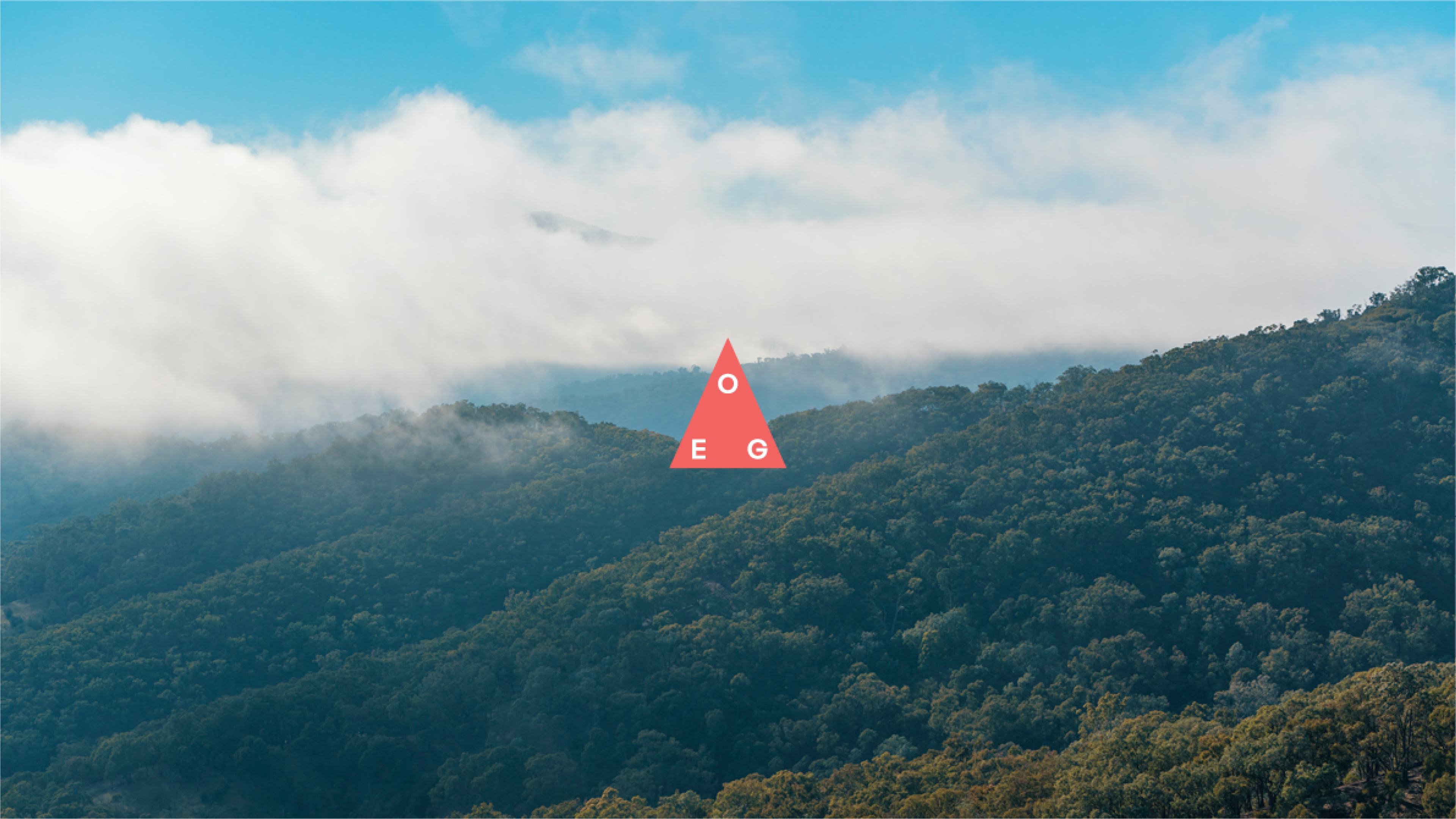
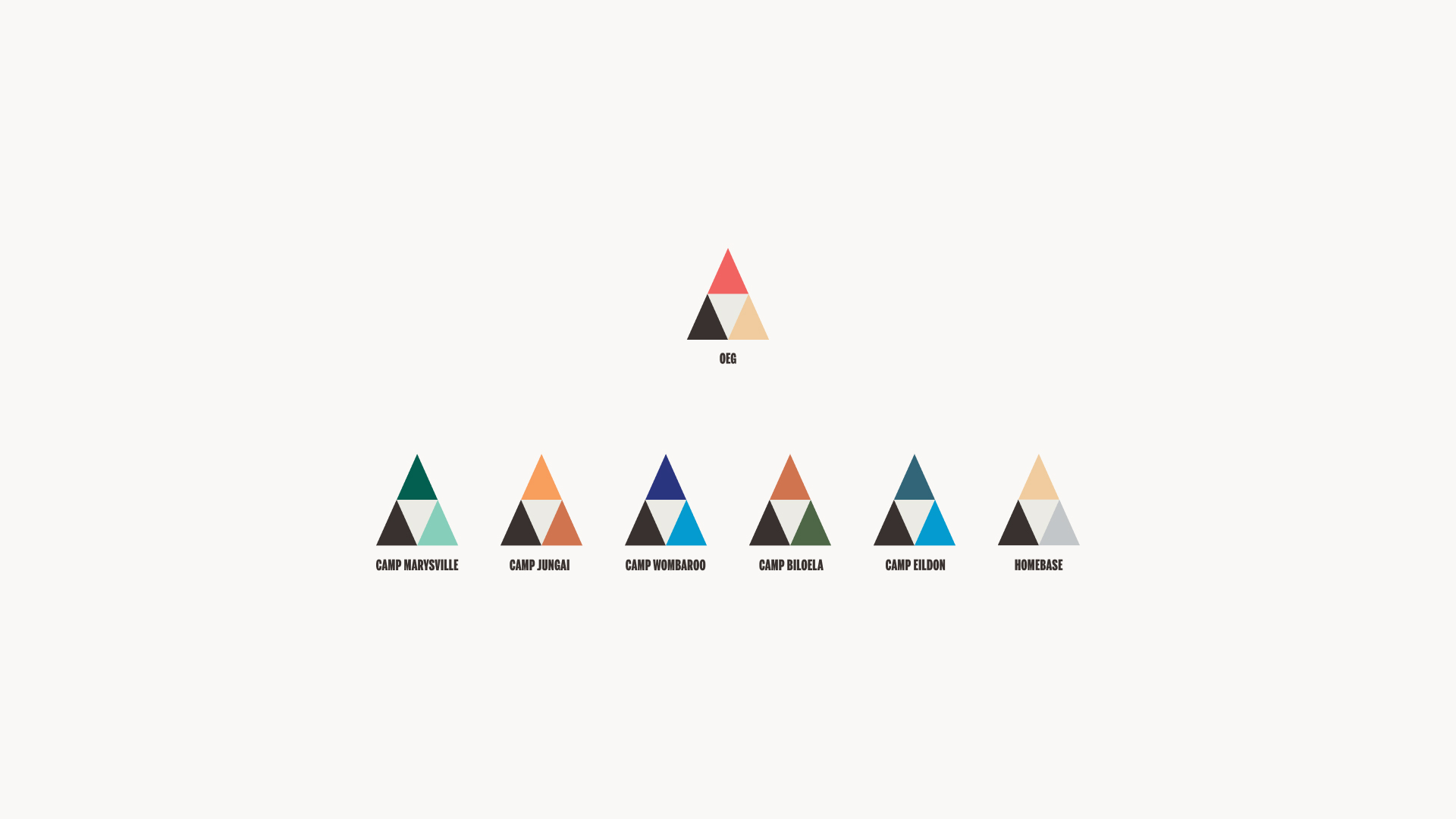
OEG


,
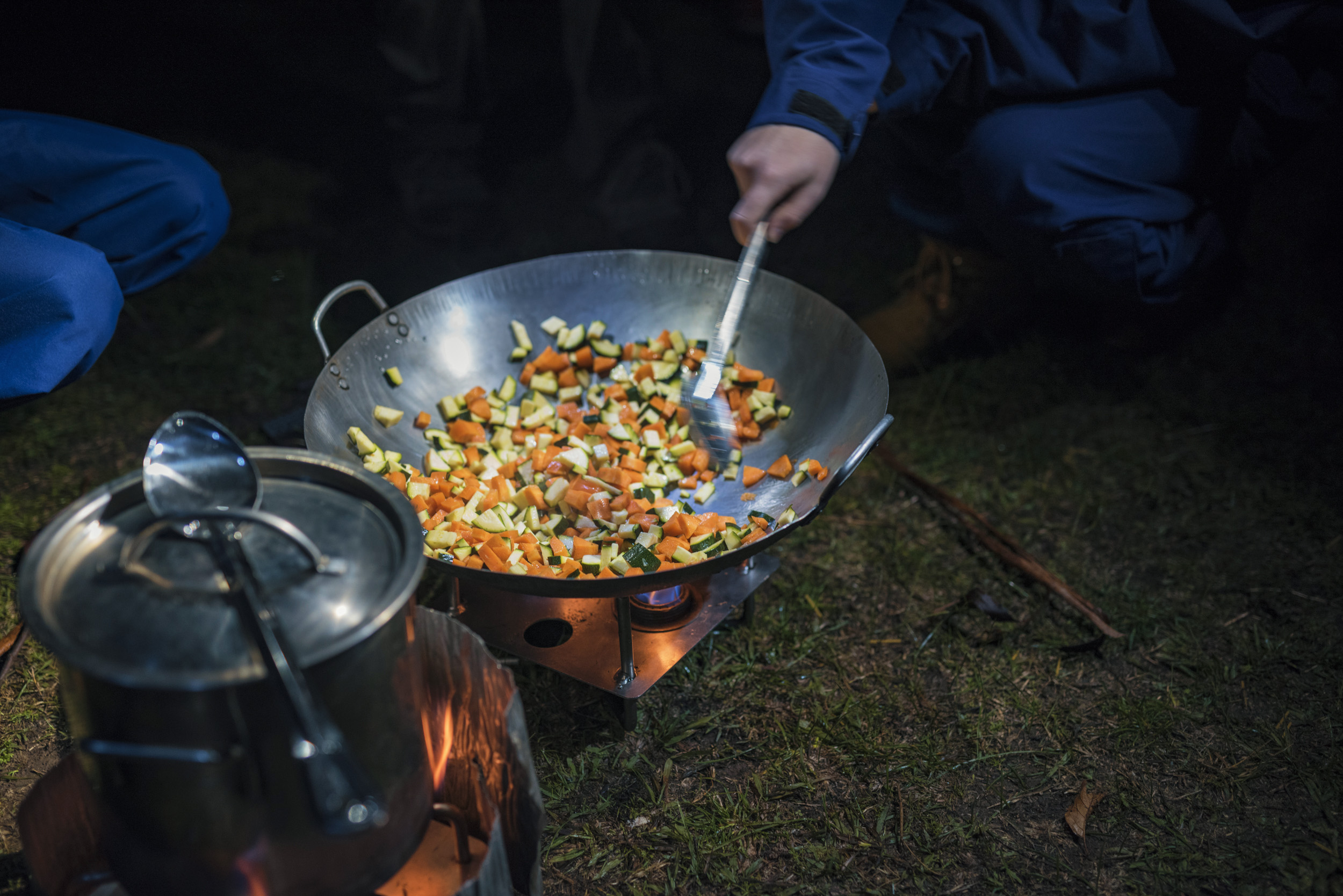
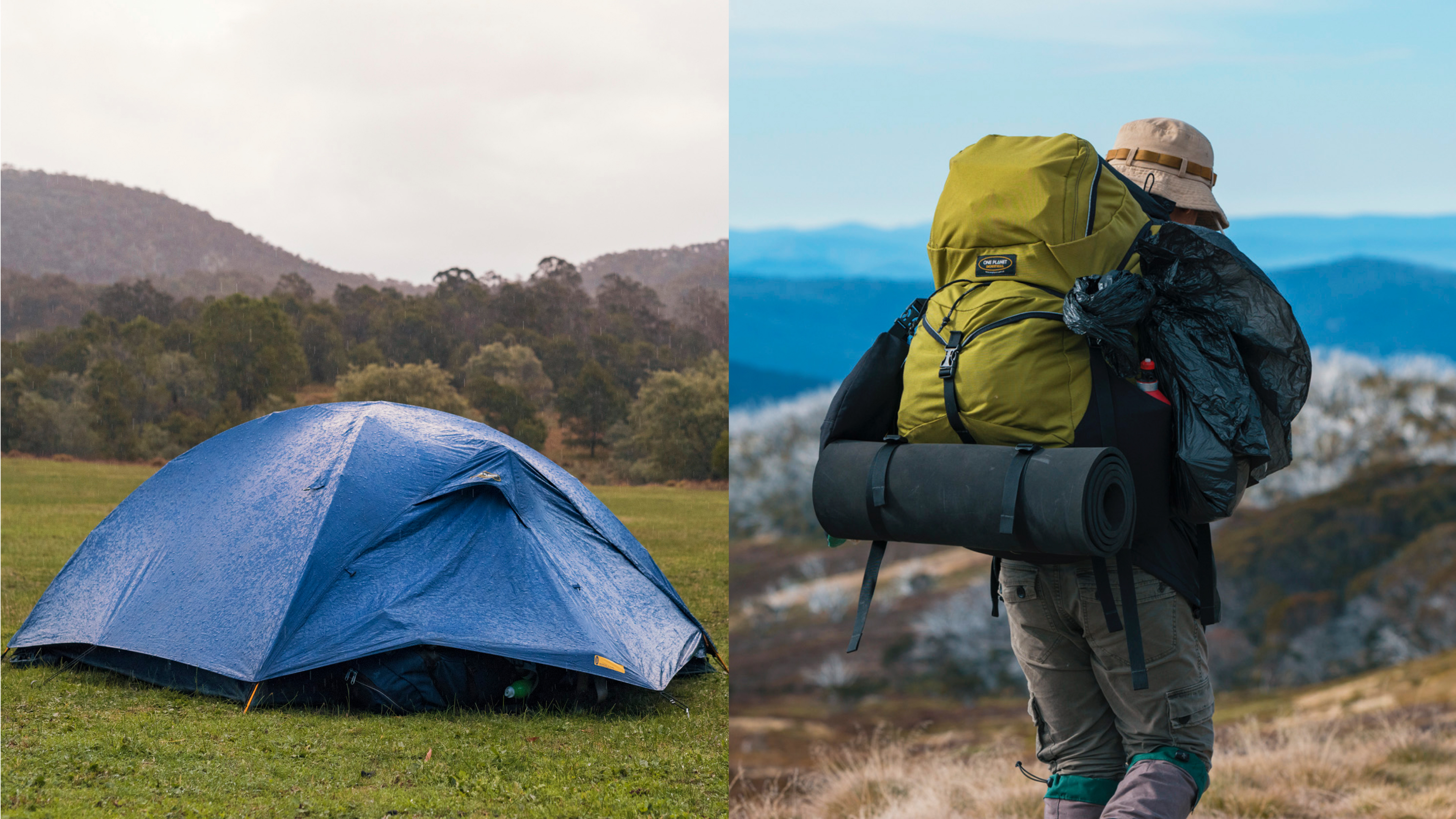
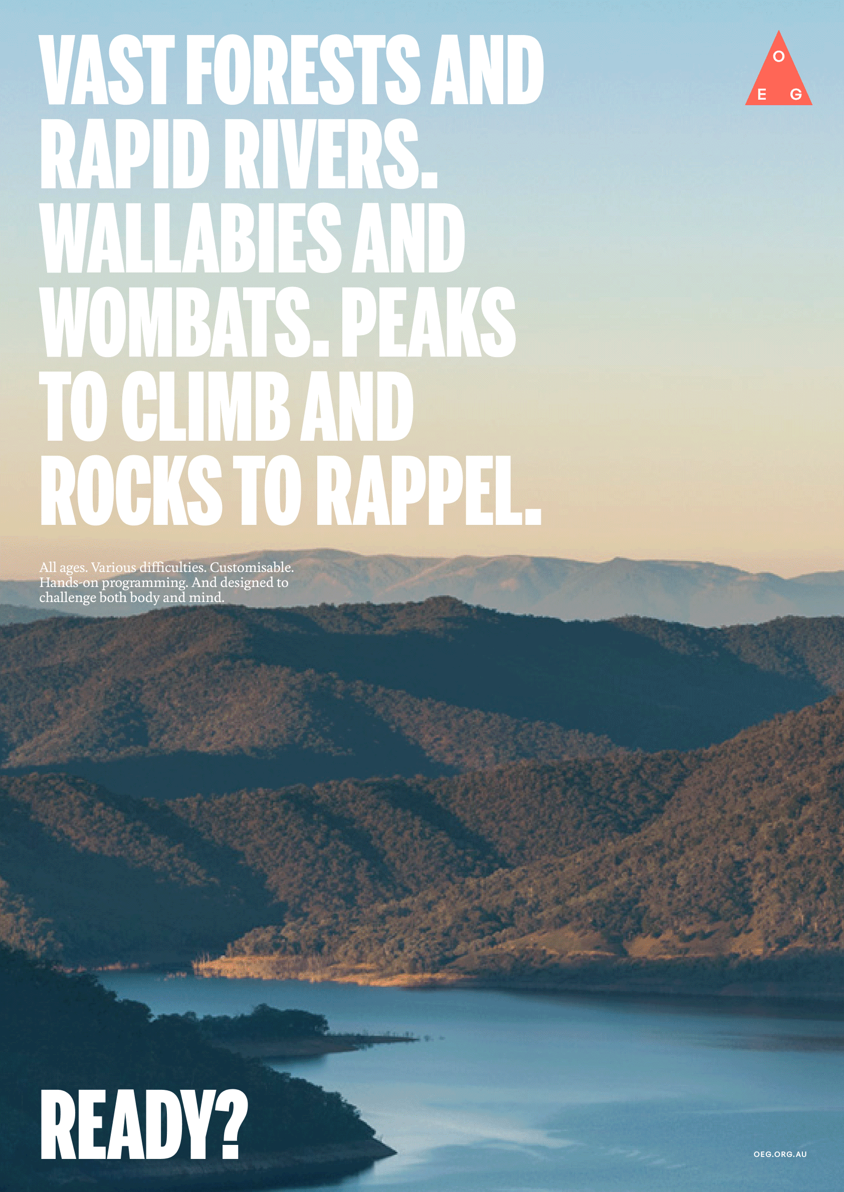
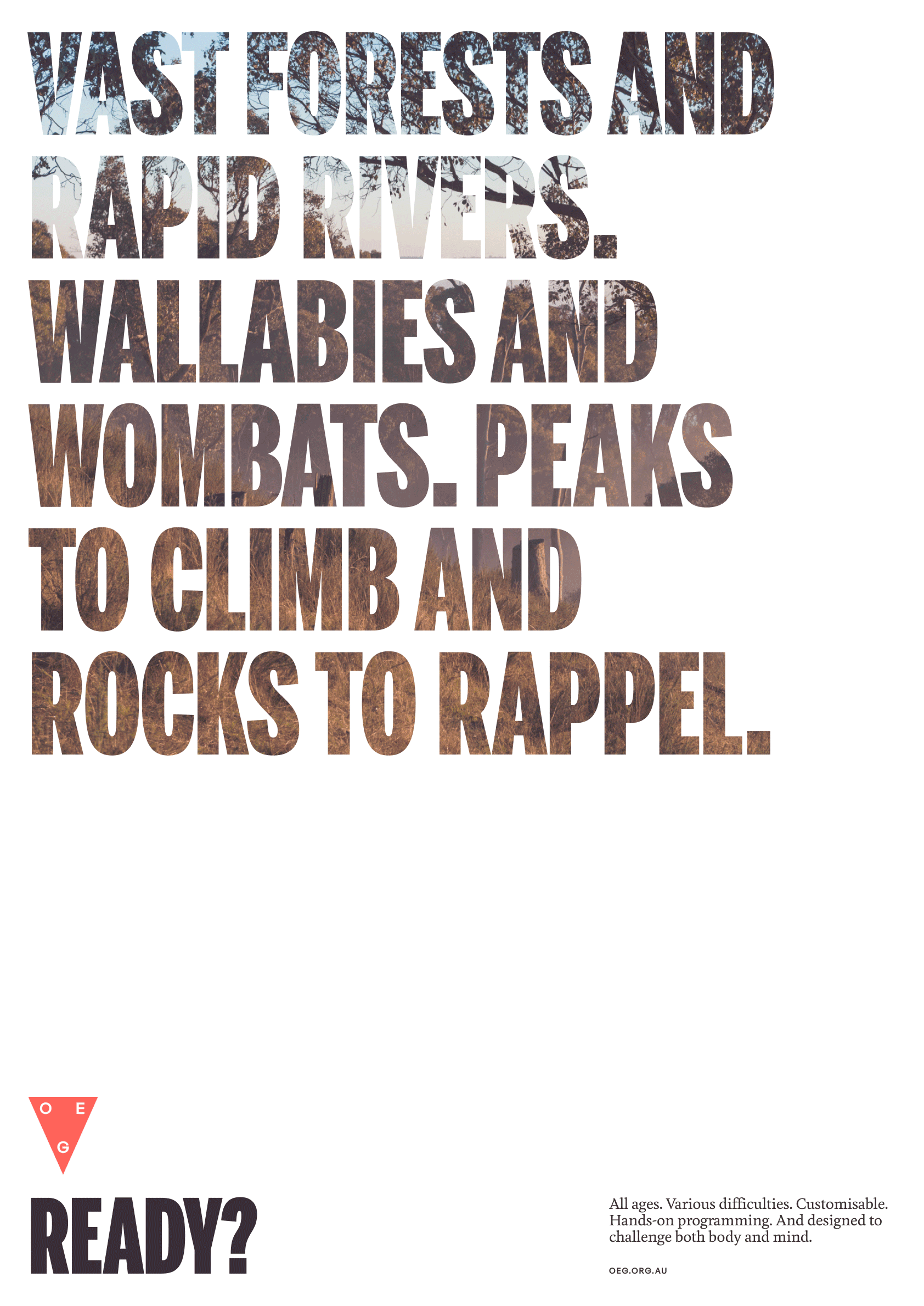
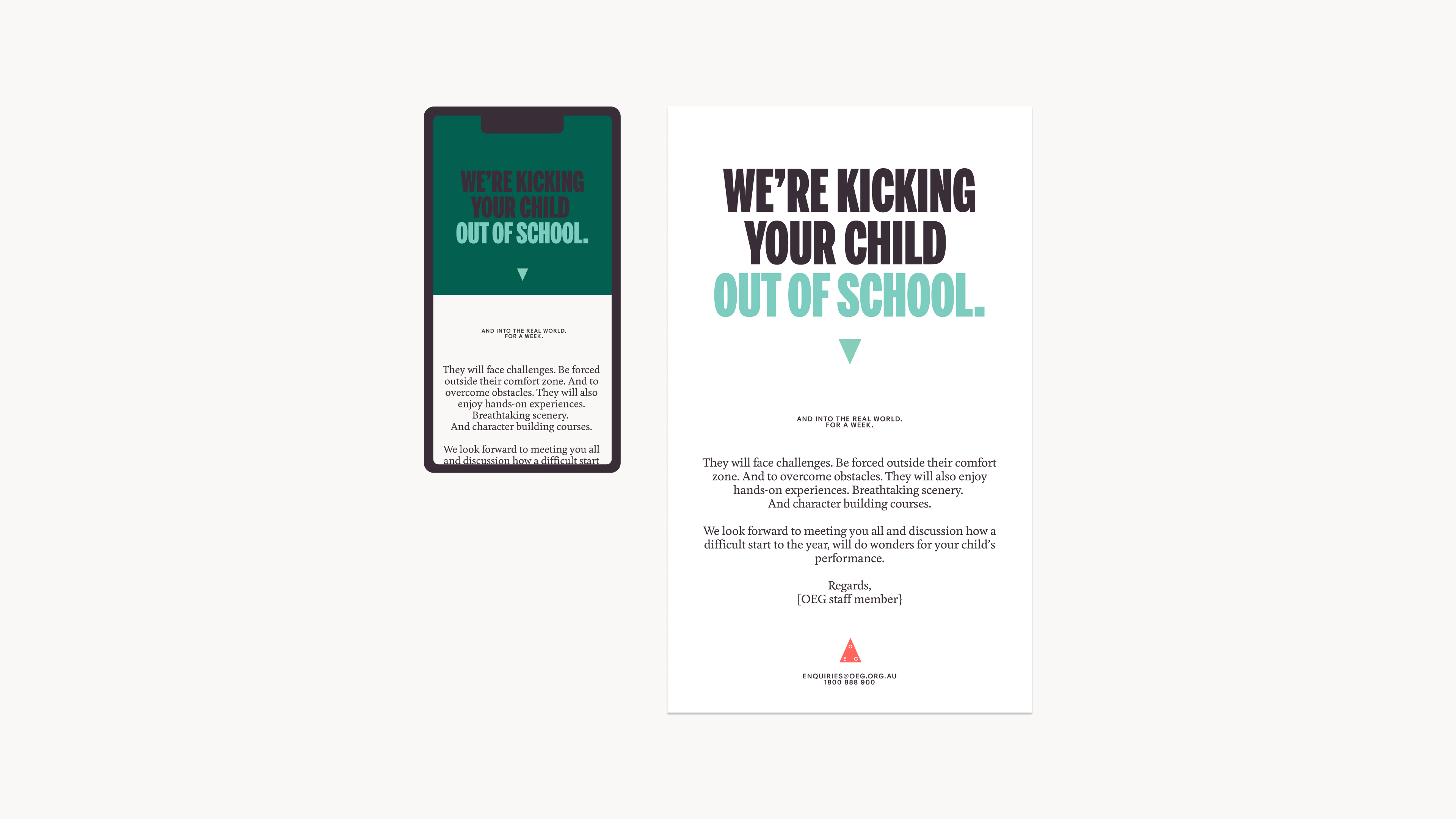
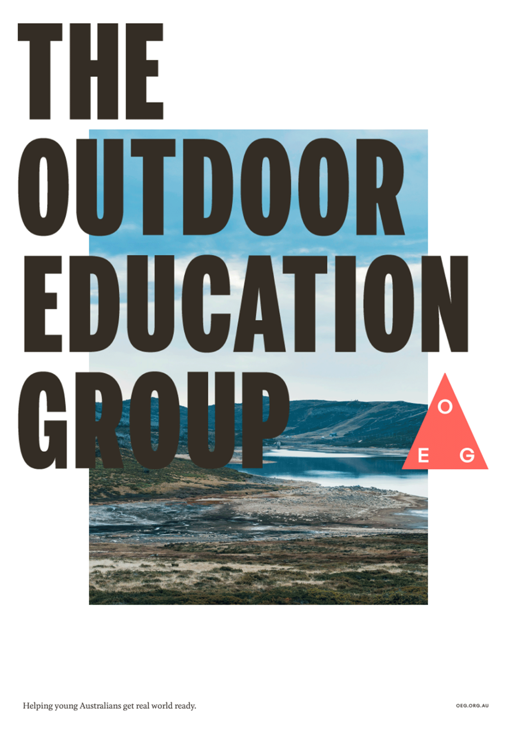
The Outdoor Education Group (OEG) is a non-profit organisation providing outdoor education for young people. The brief was to help this industry leader refresh their thirty-year-old brand identity, and better communicate the many benefits of outdoor education to their younger audience as well as to schools and stakeholders.
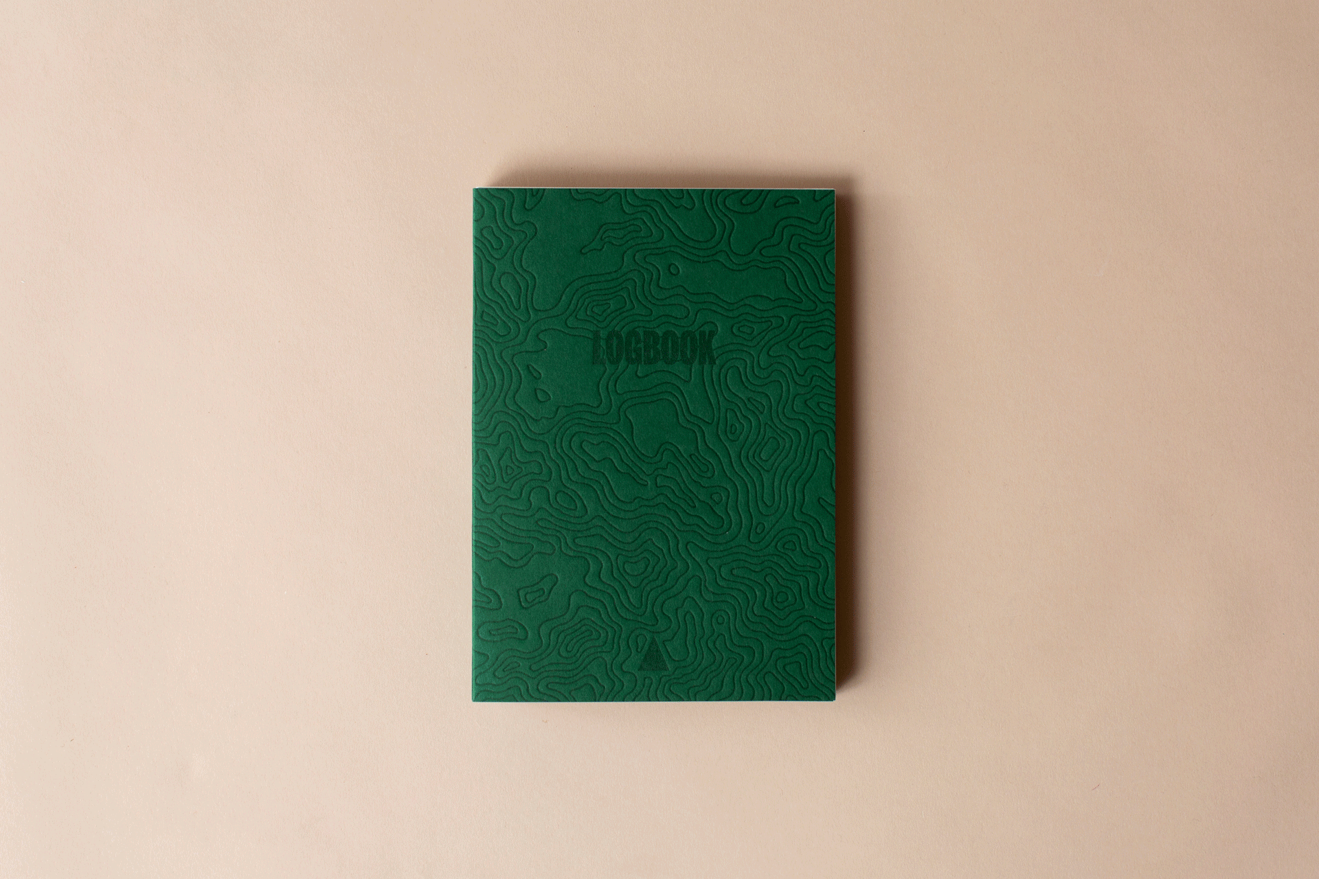
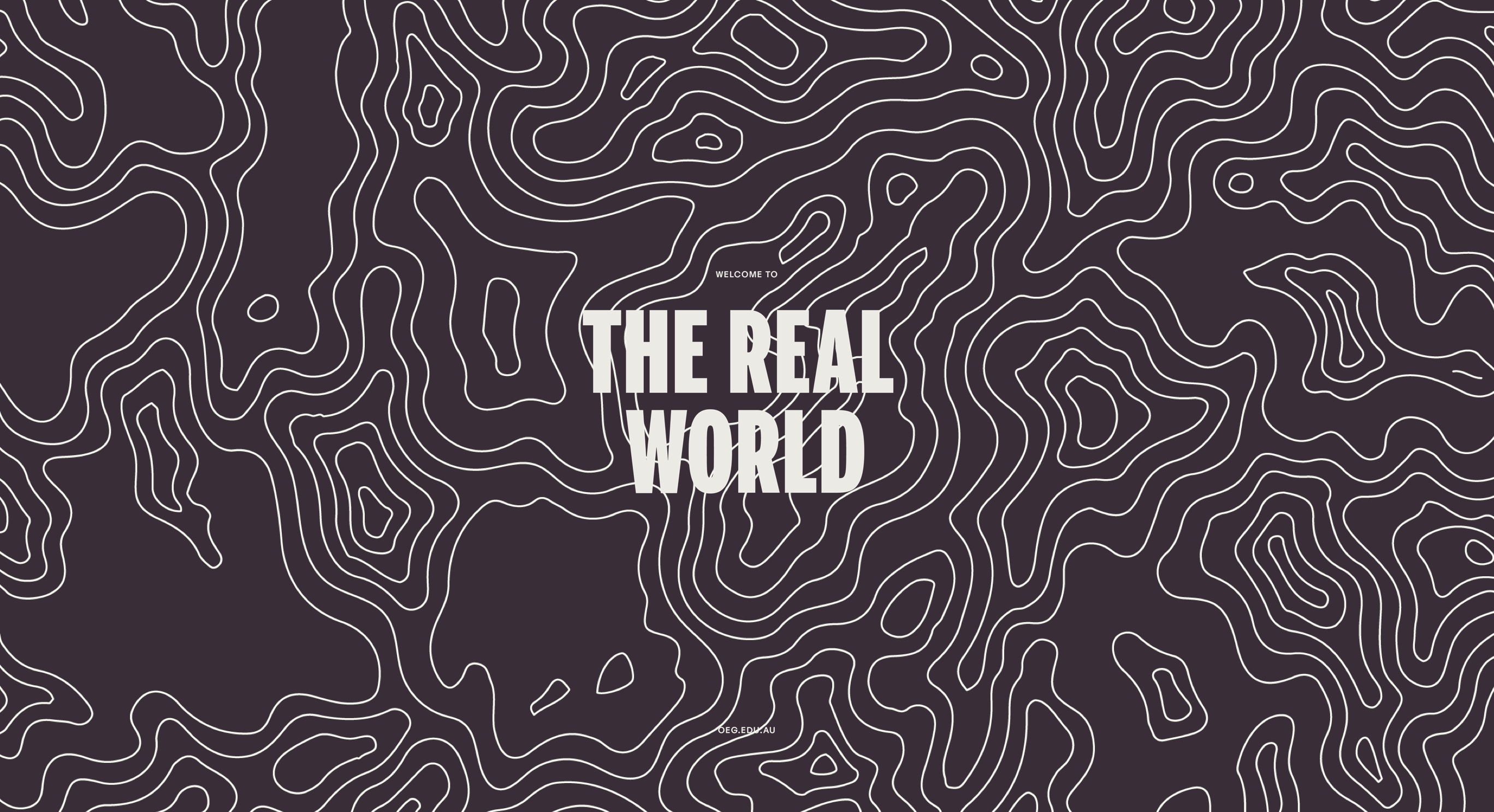
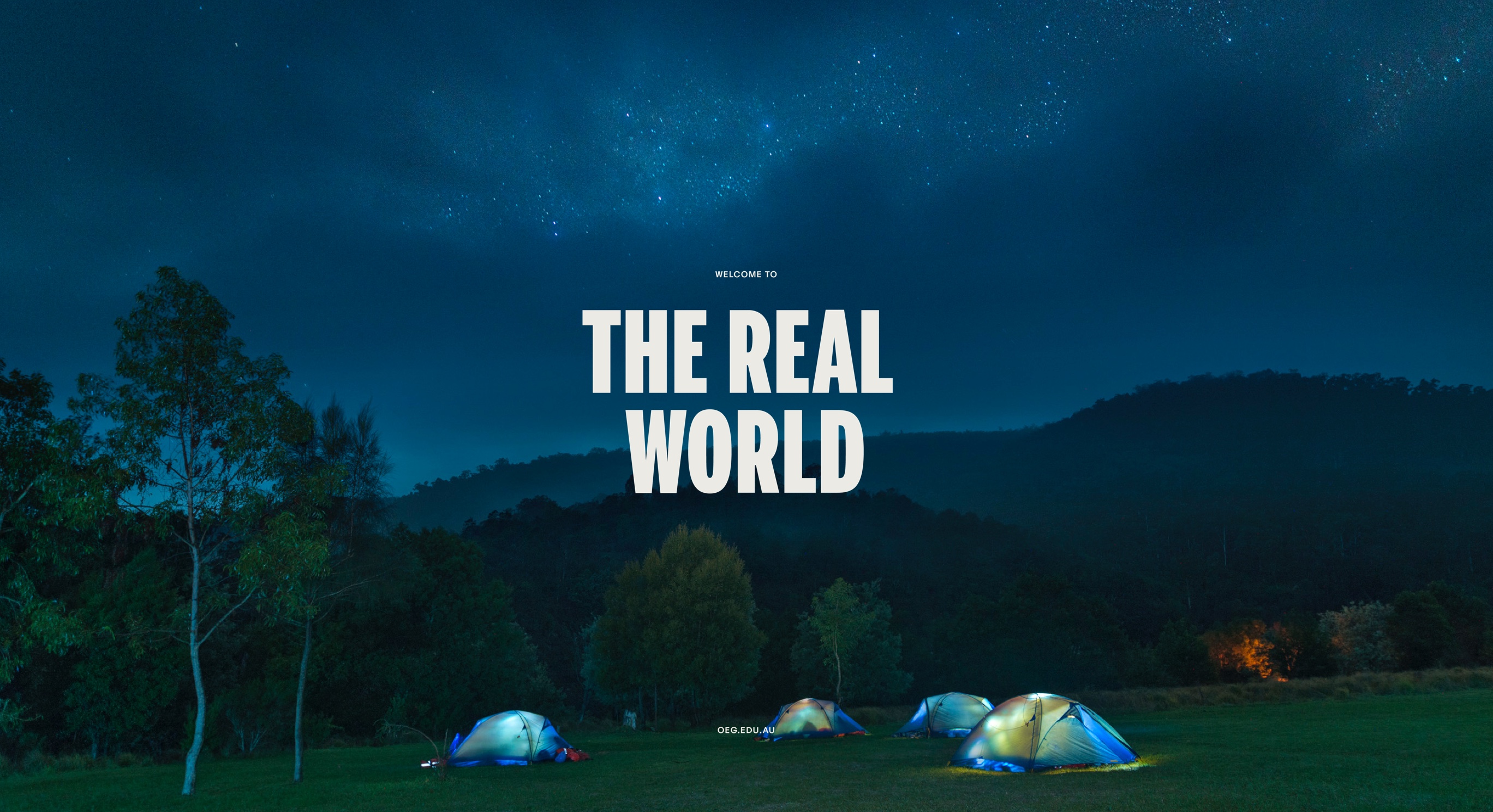
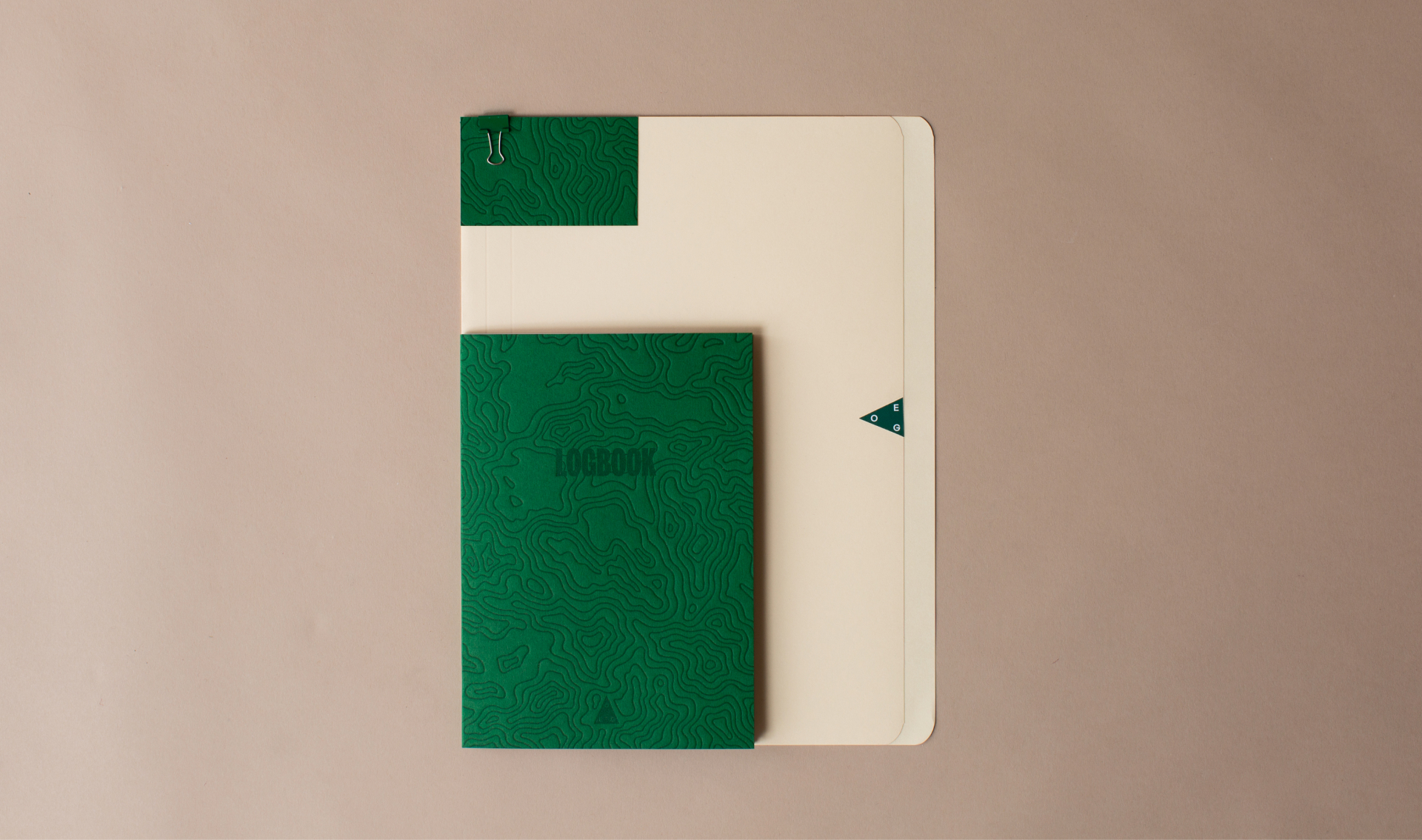
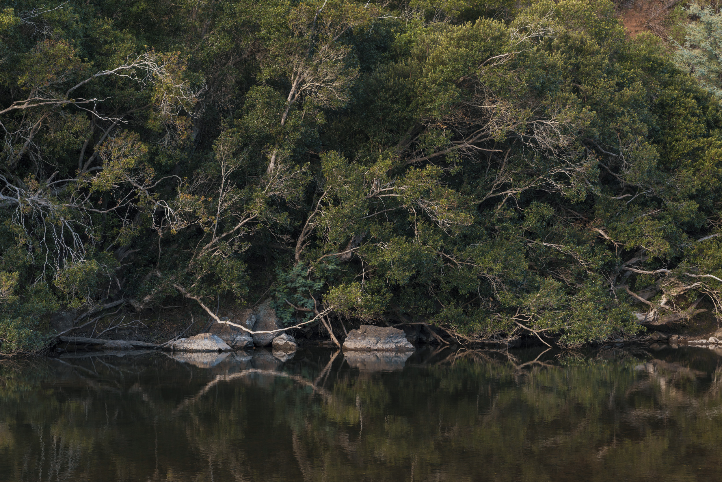
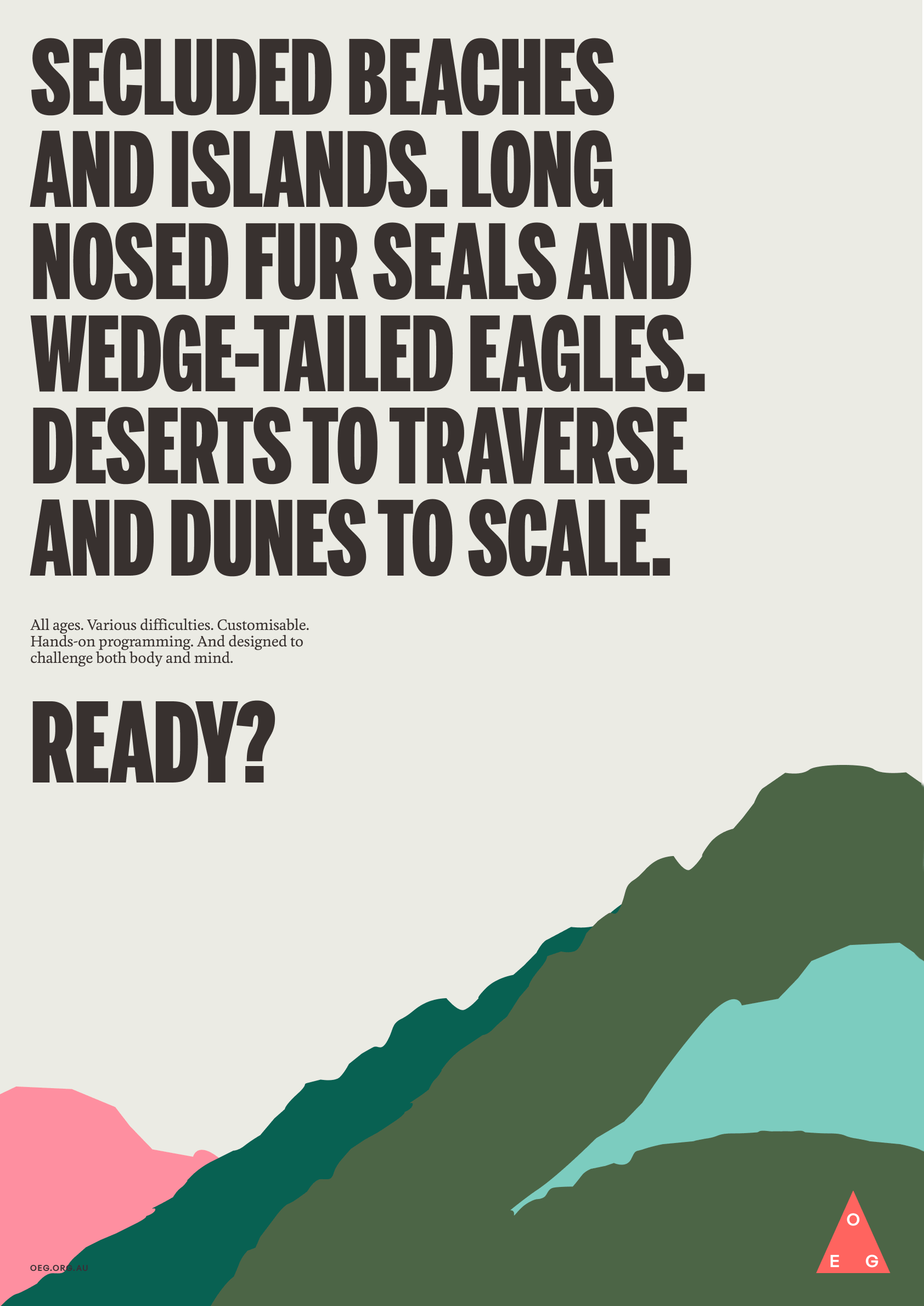
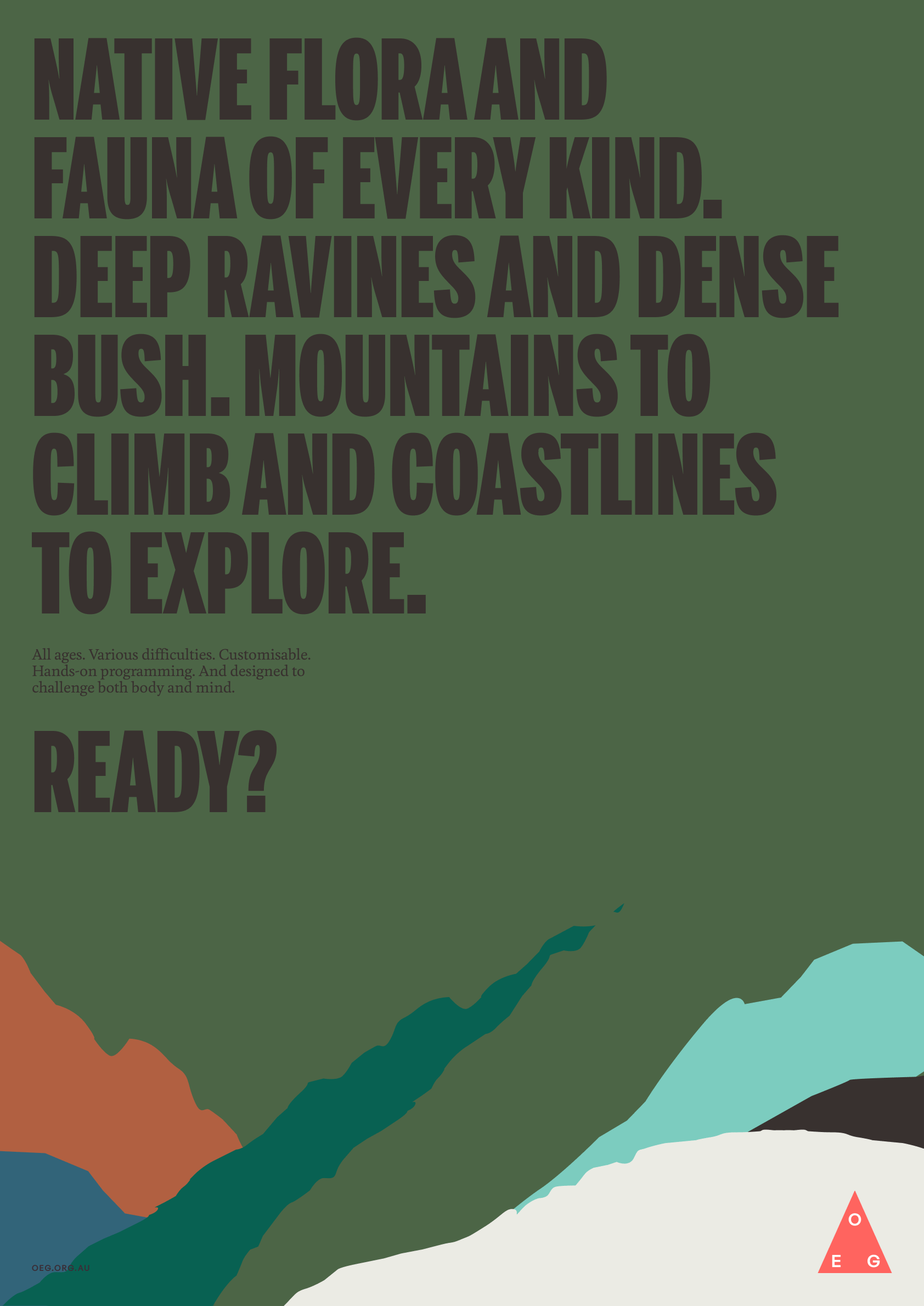
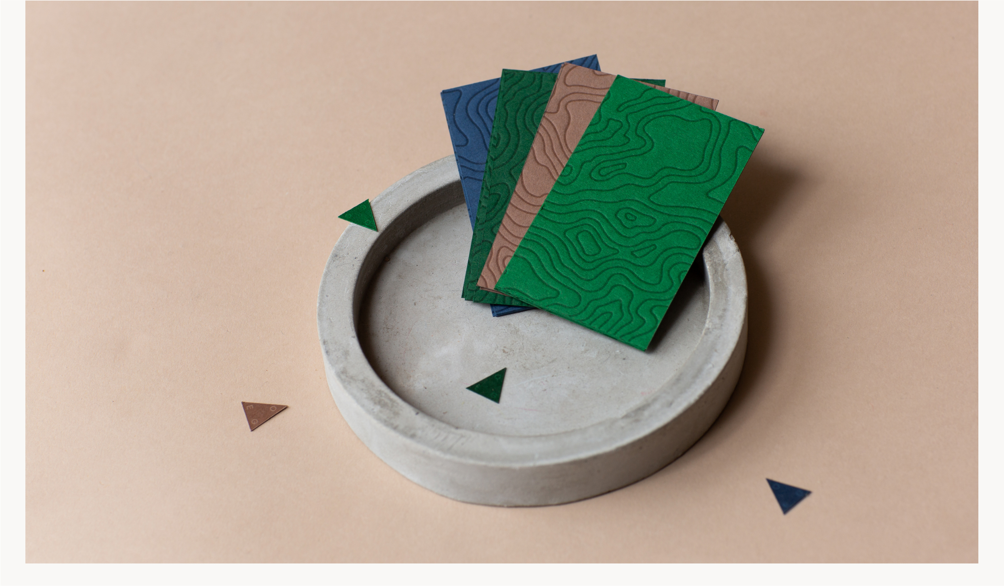
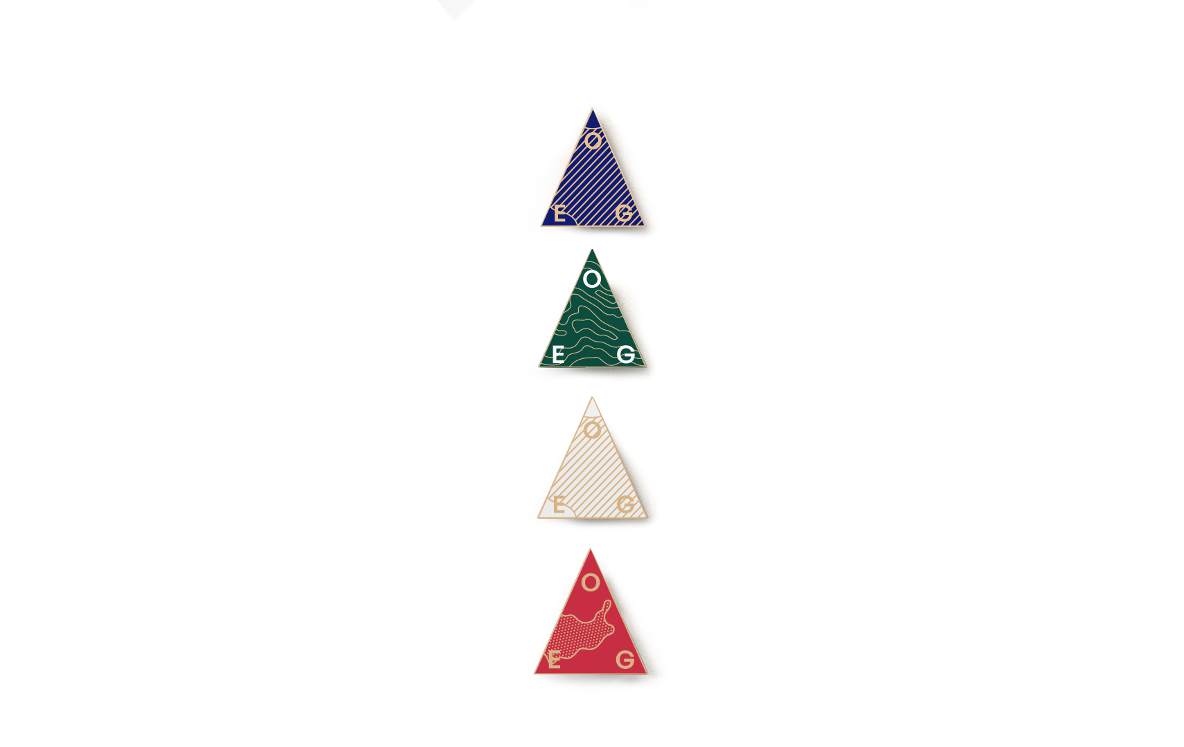
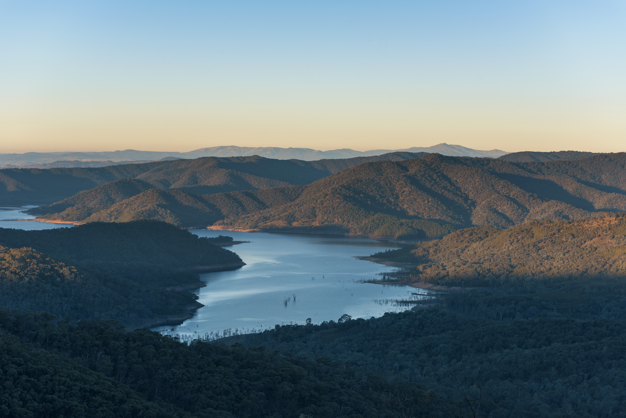
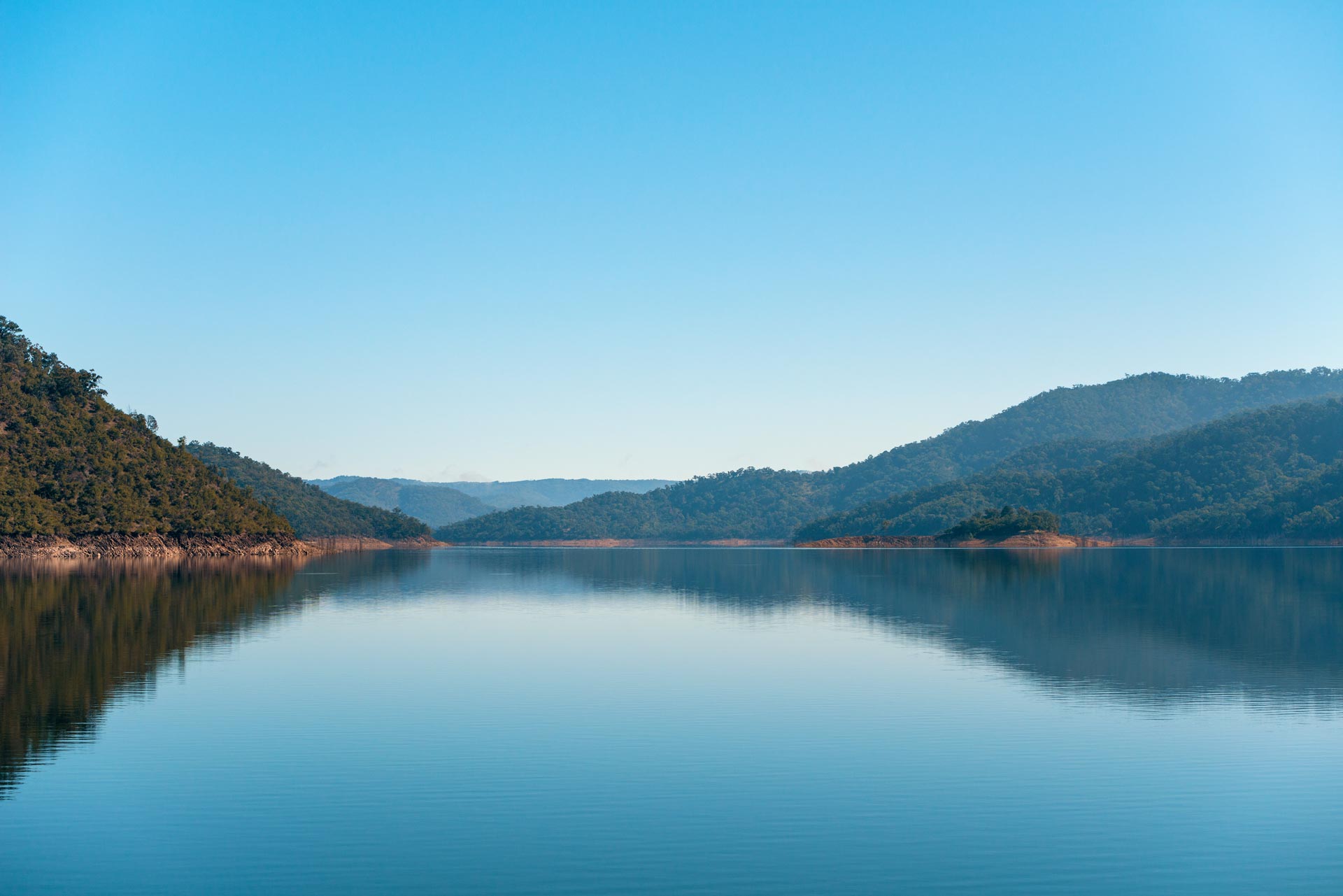
The solution takes a “digital first” approach to an otherwise analog brand, celebrating the outdoors and discovery, and using language borrowed from orienteering and cartography. The palette draws on the Australian landscape, and vintage field guides and adventure movie posters inform the typography. The challenging but honest tone of voice distills messaging down to its most basic form, evoking a ‘Shackleton-esque’ sense of adventure while communicating the benefits of outdoor education. Each OEG campsite is given it’s own sub-identity, with unique illustrations and colour palettes inspired by the different environmental characteristics of each place.
Role: Leading the design and execution of the project, I worked closely with the client, web developers and photographers from inception to launch, and provided guidance to the organisation on how to apply their new brand guidelines.